“Automation is useful in the work of every designer. It saves precious time on repetitive tasks and helps us solve certain problems more quickly and easily.”
Link: Introduction To Photoshop Scripting | Smashing Magazine.
“Automation is useful in the work of every designer. It saves precious time on repetitive tasks and helps us solve certain problems more quickly and easily.”
Link: Introduction To Photoshop Scripting | Smashing Magazine.
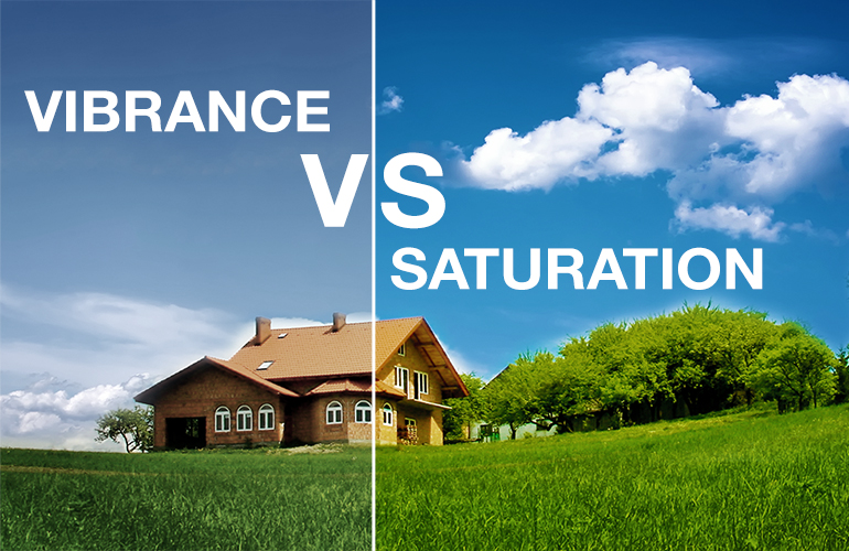
Este interesante artículo de iceflowstudios.com, nos muestra la diferencia visual que existe entre los ajustes de VIBRANCE y SATURACION aplicados a fotografías.
En síntesis, es importante recordar que el ajuste de VIBRANCE evita el llamado “Skin tone” especialmente en fotos que contienen personas.
Es un ajuste un poco menos “potente” que el de SATURACION.
Les sugiero leer el artículo completo: Vibrance VS Saturation in Photoshop.
“This post rounds up 10 declarations and tips that every web designer should have available in their CSS arsenal.” By Chris Spooner

“Pepsi logo price tag: $1,000,000
The new Pepsi logo was designed by the Arnell Group in 2008. The listed prices include a complete branding package unless otherwise noted.”
Some unbelievable prices (high and low) for the logos we see every day. Was your company logo in one of these ranges?
via Famous logo designs and how much did they cost? | StockLogos.com.
This is really a remarkable article about this more and more recognized trend. Google actually recommends using this new standard, by serving one HTML for all devices.
Check out this article from inspirationfeed.com

After being offline for a while, we decide to get back on track with fresh publications on